Touchless Control and the lessons of history
Ah, the endless quest for new iPhone features. Last week, we learned of the looming possibility of curved screens and Touchless Control.
Of course it’s silly to analyze features that are years away, if they ever come to exist at all. But what kind of technology enthusiasts would we be if we didn’t talk about our hopes, dreams and fears? This is far cheaper than professional counseling.
It can often be useful to put new ideas in context of old ones.
Curved glass? Yeah, okay. I trust Apple when it comes to hardware design. Touchless Control? Sorry to say, I’m trusting Apple a bit less in the area of usability these days.
The idea of Touchless Control sparked a few neurons that had been tucked away in the rarely-visited iPod section of my brain.
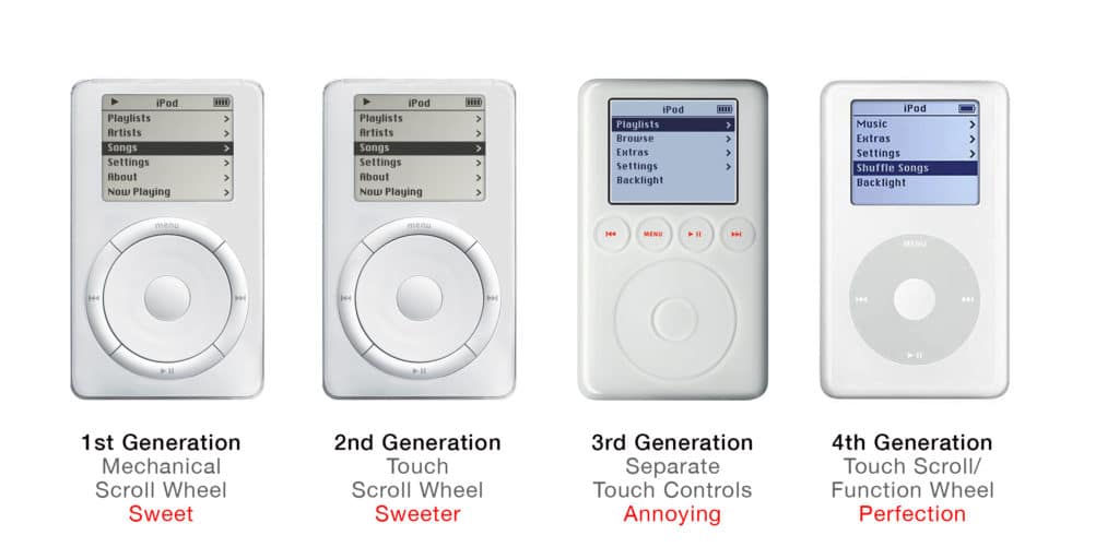
The greatest usability feature of the original iPod was its revolutionary Scroll Wheel. Nobody had ever seen such a thing before. It helped propel iPod into the hearts and lives of a zillion customers, far beyond the typical Apple crowd. At last there was a really cool and effective way to control music on a portable player.
Looking back with today’s standards, the Scroll Wheel on the original iPod was pretty clunky. It was a mechanical wheel that actually rotated under one’s finger.
That first iPod was a huge success, but of course Apple went about the business of improving it year after year. In the second generation iPod, the mechanical Scroll Wheel was replaced by a touch-sensitive version. Vastly better, sexier and more futuristic.
It was in the third-generation iPod that Apple “improved” itself into a bit of a mess. What better way to streamline this thing, went Apple’s thinking, than by making the Control buttons (menu, play, next, previous) work by touch also?
It sounded good on paper and it demo’ed nicely, but it also made this super-lovable device significantly less lovable. Touch on the Click Wheel required one to slide a finger. Touch on the control buttons required only a touch—even if that touch was ever so slight and unintentional.
It could be infuriating, especially if you reached for the iPod while driving and kept your eyes on the road. You’d end up skipping songs by accident.
It was one of those steps forward that was quickly seen as a step backward—even by Apple. One year later, new iPods eliminated the separate touch controls, re-integrating them into the Scroll Wheel and requiring a push instead of a touch. Apple would never deviate from this design again.

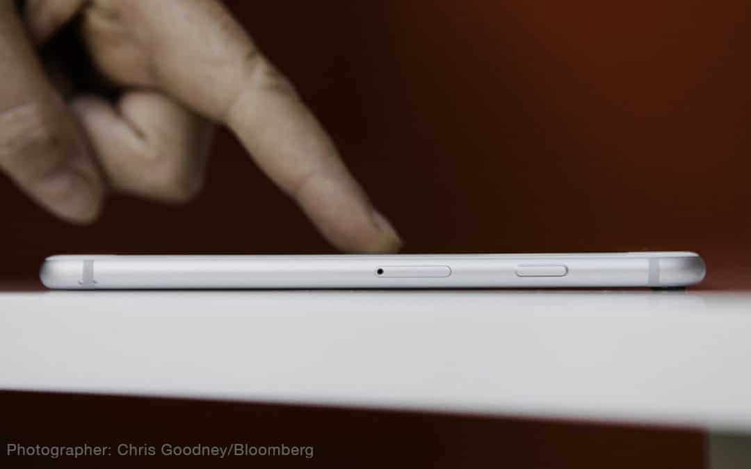
Which brings me to last week’s iPhone rumors. On the surface, the idea of Touchless Control sounds intriguing. For certain functions, there would be no need to even touch the screen—simply bringing one’s finger close to the screen would be enough to initiate an action.
You can see why this idea brought back memories of the touch-control iPod. Making devices easier to use is and should be the never-ending quest, but Apple must never lose perspective.
When slickness trumps functionality, the natives get restless.

