A sign of life in Apple billboards
Zinger! Bang! Take that, Android!
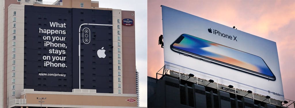
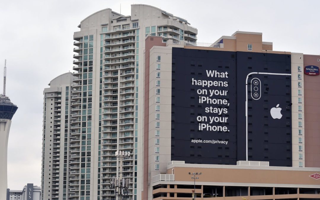
Apple ran a witty (and wordy) billboard outside the CES Show in Vegas this week, and it became a news story in itself.
If you’re relatively new to Apple, this sudden burst of verbosity must have come as a shock. You might have thought that the non-headline “iPhone XR” was as clever as Apple gets in a billboard.
Is this a whole new Apple? Or just a temporary lapse of humdrum?
Actually, it’s an echo of an earlier Apple, when headlines would both amuse and inform.
Steve Jobs’ goal was never just to sell a product. It was to build a stronger brand, and headlines were a big part of that.
Though he didn’t do the writing, Steve ruthlessly enforced the creative standards. In some way, every ad had to communicate that Apple was smarter, better and even funnier. Not goofy funny, but sophisticated funny.
It’s just a common-sense way to build a brand. In Steve’s eyes, any ad that failed to enhance the Apple brand was a lost opportunity.
For years, I’ve felt that Apple’s outdoor advertising has been a parade of lost opportunities. It’s important to celebrate design, but not at the expense of wit. Apple’s design-centric billboards have virtually no buzz value, largely because they are wordless.
Here’s a side-by-side comparison of the CES billboard and one of Apple’s typical billboards.

Which makes you think Apple is smarter? Or more inviting? Or more human? And which makes you feel like Apple is simply a Samsung competitor?
This is why I got a little misty-eyed seeing the CES billboard. It was like a tiny window had opened up, revealing a part of Apple’s personality that has withered from lack of use.
I miss the days when Apple felt compelled not just to show us a product—but to make us smile as well.


You’re right! And advertising is just one example where Apple liked putting a grin on people’s faces, going back to Moof the Dogcow and before.
Idea: bring back something like the Mac vs. PC campaign, but make it Android vs. iPhone, privacy-focused, where the Android person is invasive, creepy, nosy, etc… will be tough to top the John Hodgman casting, but could be good! Maybe Steve Buscemi.
Yes. I love it! Good ol times!
I see those two signs as applying to different speeds. the CES sign is for people walking the iPhone X billboard is for the 55mph crowd. Both work for their intended audiences. Sentimentality is non-existent in ad philosophy, only if the eye can perceive and digest it matters. imho
I agree that the CES billboard is for people on foot and the iPhone X billboard is for those driving by. Absolutely, you need a short read for the latter, and Apple outdoor advertising has long embraced that philosophy.
That said, my point is that Apple used to be admired for being simultaneously brief AND clever. Today, it is simply brief. I miss the Apple billboards that made you smile as they conveyed an important selling message. Those billboards helped create and maintain Apple’s brand personality, which serves to attract new customers and keep rewarding current customers.