HomePod mini: in search of the lost cord
Damn, HomePod mini looked pretty great in Apple’s unveiling last week.
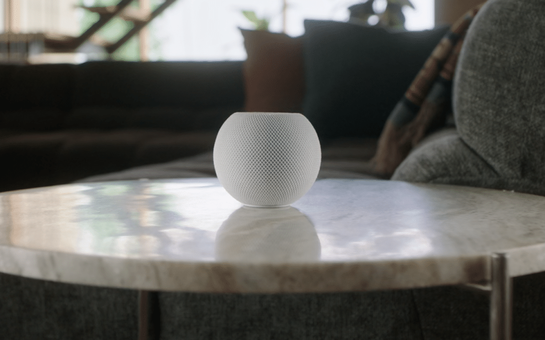
They had me from the first image where it sat elegantly on the side table. Simple. Clean. Not a cord in sight!
It was my ultimate music-player-intelligent-assistant fantasy come true. A gorgeous device I could put absolutely anywhere.
Until it wasn’t.
Silly me. I made the unforgivable error of believing my eyes. At the very end of that scene, for just the briefest moment, came a glimpse of a cord trailing away from mini.
Nooooo!
From there, Apple took us on a winding path visually, with the vast majority of shots showing a “cordless” HomePod mini. A casual viewer could be forgiven for drawing the wrong conclusion.
Out of curiosity, I went back for a re-viewing.

In 23 scenes featuring HomePod mini, the cord was hidden in 16. It was visible to some degree in seven, but only three of those showed it clearly.
So … marketing.
This isn’t a condemnation, merely an observation. It’s the ad man’s job to put the best foot forward and minimize the negatives—and trust me, I know all about that.
I once co-conspired with Steve Jobs to do the exact same thing.
Been there, done that
Who among us even remembers the first iMac? It was a 1998 runaway hit, launching Apple back to profitability, but perfect it was not.
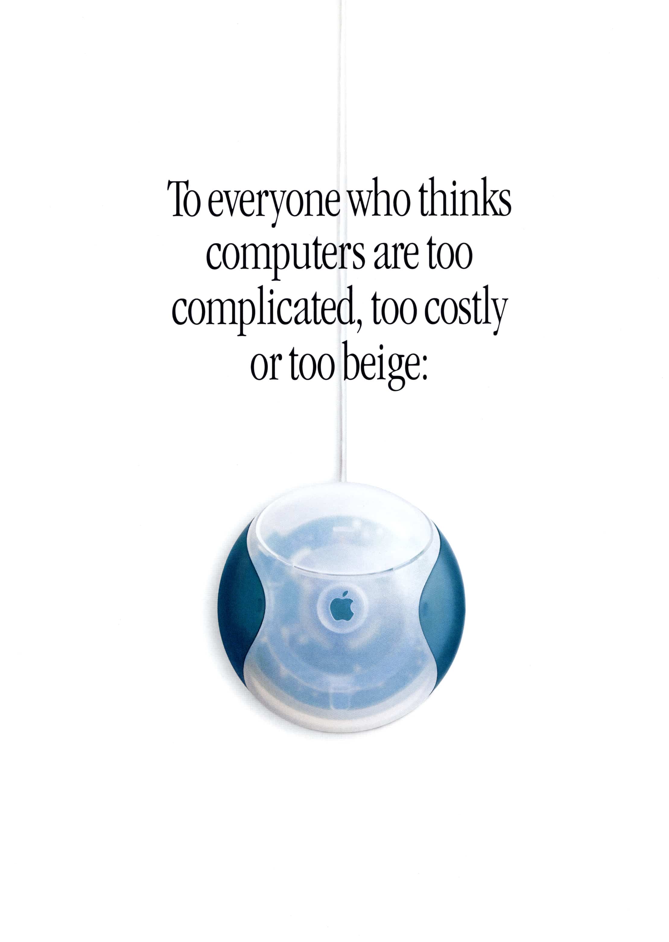
Part of Jony Ive’s breakthrough design was a round mouse. Lovely to look at, but a horror to use—because by feel alone, one couldn’t tell which direction it was pointing. It was unsettling to move the mouse up and see the cursor go down.
How Steve ever released this mouse into the wild will forever remain one of the world’s great mysteries. But he did move quickly to right this wrong by creating the Apple Pro Mouse.
The new mouse wasn’t built to achieve parity, it was designed to leap beyond “common” mouses. It was sculpted in acrylic, sleekly designed with zero buttons. The entire surface functioned as a button.
Steve thought the Pro Mouse was so cool, it deserved its very own TV commercial. So our ad team leapt into action.
The winning concept portrayed Pro Mouse as a high-performance sports car, revving its engine, speeding across the screen, sliding through curves, etc. The soundtrack was Born To Be Wild.
But this idea hit a pothole. The Pro Mouse was corded, and if we showed the cord, the car metaphor wouldn’t work.
Our solution was to shoot the mouse without the cord. Yes, that misrepresented the actual product, but we would bring it back to reality at the end with a final corded shot. Steve enthusiastically approved, and the final ad looked like this.
Honestly, I don’t remember any complaints about the missing cord, glaring as our omission was. Likewise, I don’t expect anyone to complain about HomePod mini’s purposefully hidden cord.
In the never-ending battle between legal and cool, Steve Jobs consistently picked one side. It’s safe to say that this bit of Steve’s DNA still lives inside Apple.
The shape of things to come
The design of HomePod mini isn’t exactly a huge leap from other devices, like the 4th generation Echo Dot. Interestingly (at least to me), it also harks back to an Apple product 20 years in the past.
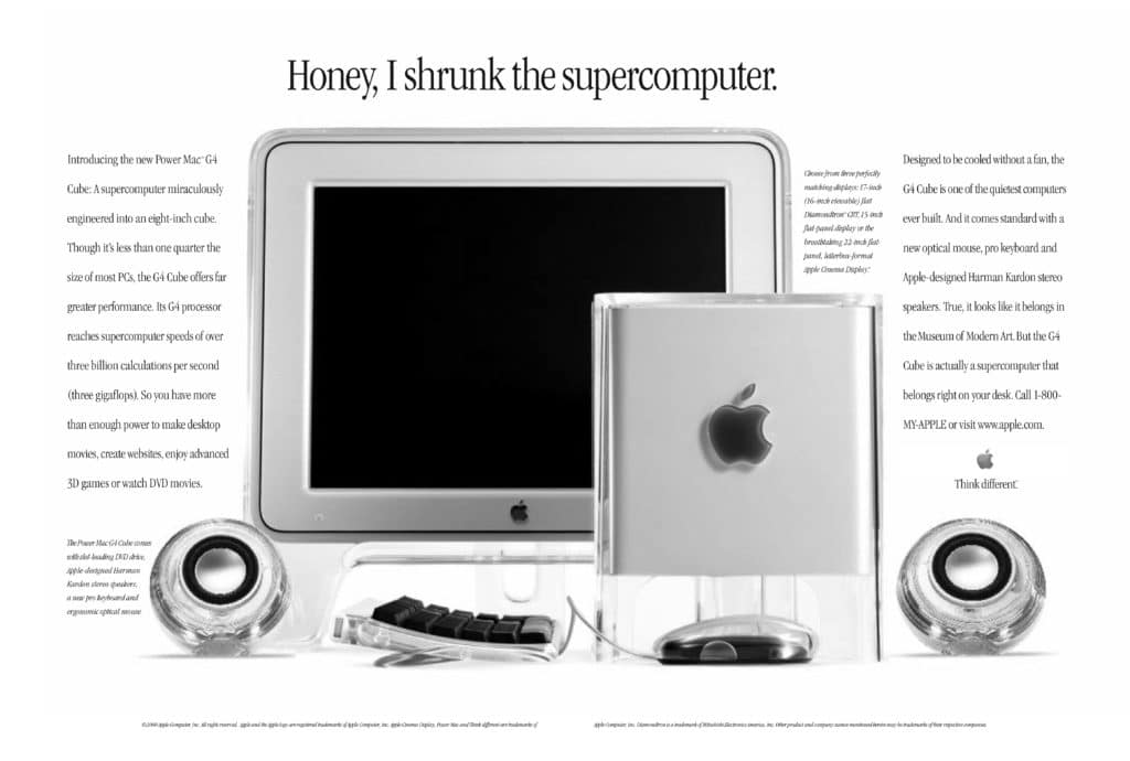
I’m talking about the speakers designed for the ill-fated Power Mac G4 Cube.

Though the G4 Cube quickly died of multiple causes, its design was outrageously original for its time. It consisted of an eight-inch acrylic “supercomputer” with flat-screen display (cool!)—and two round, transparent Harmon Kardon speakers. It actually became part of the Museum of Modern Art’s design collection.
I don’t imagine HomePod mini owes any of its technology to its ancient ancestors. Just the same, it warmed my little heart to see Apple give round speakers another go.
So much so that I am looking forward to giving HomePod mini a good workout when it starts shipping. I’m moving my side table closer to a power outlet as we speak.


Looking forward to the HomePod mini also. In fact, I can’t wait. I know exactly where I’ll put it.
great stuff!
also – i have to put my email address and website and name every time i want to comment (even though I click “save my name, email…” every time. wish i could just create an account and log in =)
Hmm, let me investigate.
Was the Pro Mouse spot all stop motion, or was there some trickery with magnets happening?
Actually, we never used stop motion. We used motion control for all of our product shots that required movement.
Thanks for this, Ken! It’s great to see another blog post from you. Always so informative for those of us who follow Apple.
Speaking of cords, ken where are the power, monitor, usb, and speaker cables that should be coming out of the bottom of that g4 cube?
in fact it looks from the image like apple managed a cordless round speaker in 2000, pretty disappointing they’d regress and bring back cables for the HomePod mini
Ouch, you caught me on all those cords required to actually use the Cube. Guess we took artistic license there as well. But no, Apple didn’t regress on the speakers—they were corded as well.
test
Always look forward to your insightful posts. I didn’t even notice the cord thing. I do remember the pro mouse ads. (And lack of cord)
Wonder if this will be a hit.
I love the debate of “to cord, or not to cord”, and have lived inside it for more than 3 decades. Personally I think that UX specialists need to spend more time considering and designing for cable management in ways that support functionality (of course) and preserve the treasured minimalist aesthetic. Simple? Sure. Easy? No way…