The Apple Store gets its tab back
Six years ago, Apple removed the Apple Store tab from its website.
No longer was there a central store-like place to visit online. Instead, each individual product page had its own Buy button.
File this under “Great Ideas That Aren’t So Great When You Really Think About Them.”
First, the new setup was counterintuitive. When we humans want to buy something, we instinctively look for a “store.”
Second, the online and offline Apple Stores were two sides of the same coin. One was simply the virtual version of the other. Suddenly that parallel was gone.
Imagine if the physical Apple Stores replicated the “improved” online buying experience.
Every Apple product would be in a separate room with its own private entrance. Visitors to each room would be effectively shielded from what Apple has spent decades building—a rich ecosystem of products and services all designed to work together.
This “streamlining” of the online buying experience was a classic case of overthink. Thankfully, that’s all behind us now.
Apple has an ingenious new idea to improve online buying. The new idea is to go back to where it was before the last ingenious idea.
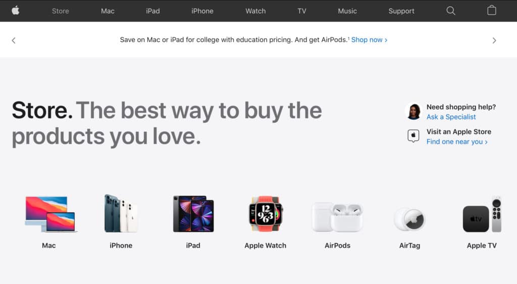
The Store tab is back!
The Buy button on each product page remains, so now Apple has the best of both worlds. But it does make me wonder.
• Why did adding Buy buttons on product pages require blowing up the entire online Apple Store in the first place?
• Why did this voyage to the Land of the Blatantly Obvious take six long years?
Whatever, we’re good now—except for one more mysterious bit of over-think. Click on the new Store tab today and this is the headline that greets you.

Really? Store?
Not “Apple Store”? Not “ Store”? Just ………… Store?
Strange, because just a flea-jump to the right of this headline is the link to “Visit an Apple Store.” So we can safely assume the word “Apple” has not become toxic.
There is a well-established pattern on apple.com. The tabs mostly have generic names (Watch, TV, Music), and when you click a tab you are greeted with the full product name on the product page.
But click on the Store tab and all you see is … Store. Inexplicable.
Steve Jobs told me that everything we did in marketing, big or small, was a branding opportunity. Wasting an opportunity was a crime.
But who was this Steve guy anyway? What did he know about marketing?
I’m feeling inspired by Apple’s new way of thinking. It’s liberating. Who needs “Apple” when you have “Store”? Generic is just so much easier, don’t you think?
Ending.


I like the change and I agree with your assessment as usual. They really need to drop the S thing on the iPhones as well. Ugh.
Having said that, the store is lacking audio artist tools and it’s annoying to thing artist means painter/drawer. Especially apples inherent strength in audio and midi support it disappoints me that they do not enhance or increase their audio ecosystem like they are their visual one.