Attack of the lame headlines
As a rookie copywriter struggling with headlines, my mentors warned me about two unforgivable sins.
One was trying too hard to be cool. The other was stooping to such overused tricks as puns and rhymes.
I rarely think about those days anymore, but every so often a headline grabs me by the throat and demands to be ridiculed. I, of course, am happy to oblige.
It happened right after the recent Apple event when I visited apple.com to learn more about the new iPhones.
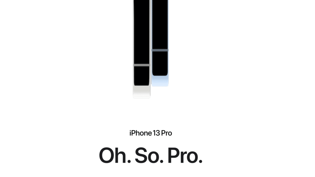
I clicked on the iPhone 13 Pro tab and suddenly there it was—shamelessly flaunting itself before a billion readers.

The rhyme! The dorky attempt at coolness! All crafted into a three-word embarrassment.
As a lifelong fan of great Apple writing, I felt a tear in the fabric of the universe. My brain sputtered, like Robbie the Robot trying to process conflicting instructions.
Steve Jobs loved humor, but he always demanded quality. Apple had to be smart-funny, not dumb-funny.
When I see headlines like this, I worry that smart is losing its fan base inside Apple marketing.
“Gee, Ken, why so fired up about a few words?”
Confession time. There actually is a reason. It involves some personal emotional pain, so let me lie down on the psychiatrist’s couch…
This headline reminded me way too much of a less-than-stellar ad effort we made for Apple long ago. Our headline was eerily similar to Oh So Pro—and similarly lame.
It happened at a time when Apple had three big product stories and Steve wanted to advertise all of them: a faster-than-Intel pro Mac, a redesigned PowerBook and the revolutionary iMac.
The result was a “three-in-one” campaign. We put one word above each product image, so they read like a single headline—
Pro. Go. Whoa.
Cringe! Paradoxically, the line came from my boss at the time, Lee Clow, one of the greatest creatives in advertising history. I don’t remember if he wrote it, or if he was simply pushing someone else’s idea.
Whatever, I was the creative director and I didn’t push back. Not my proudest moment. I felt even worse when Steve approved it and Pro Go Whoa grew into an ad, a multipage insert and even a T-shirt.
Though that episode made me squirm, I’ve managed to put it out of my mind all these years. Thank you, Apple, for re-opening the wound.
Meanwhile, back at the iPhone 13 Pro page
With Oh So Pro still ringing in my ears, I took a deep breath and started to read about my iPhone-to-be.
I felt cleaner once that headline scrolled up and out of view. I even read through the “Let’s Pro” line without the audible groan it so richly deserved.
Then, as I was soaking up all that iPhone 13 Pro goodness, I scrolled down to another headline—

Whoa indeed! The circle is complete. Oh So Pro Whoa. Couldn’t have said it better myself.
Okay, obviously all of this is in the eye of the beholder. I have my own personal demons. Most readers will sail past these words without emotional damage.
And truly, I appreciate the challenge faced by every Apple writer. All new products are inherently faster and better than the previous model, and it’s super-difficult to find a fresh way to say it.
Still, I must cling to the quaint notion that Apple’s words should adhere to the same standard applied to its products. Quality counts.
Or, to put it in terms Apple can understand—any deviation from that standard is a big Oh No No.


So, how would you promote iPhone 13 Pro?
As I said in the article, it’s really, really tough to keep coming up with new ways to say the same thing, upgrade after upgrade. This is a challenge openly discussed inside Apple (at least it used to be). I would never be so arrogant as to say “my headline is better than your headline.” I can only say that Apple has succeeded in keeping headlines fresh for the last 20 years—it’s not like all the good headlines have been used up. Creativity always wins.
Might have been better with:
This, is Pro. or
THIS, is Pro.
I’m old (but not ancient), and vividly remember my art director friend showing me the “Pro. Go. Whoa.” ad in the morning newspaper. We loved it. I think the “whoa” was warranted because of how different the iMac was from every other computer at that time/ever. The headline wasn’t trying too hard — it was how you felt whether it was spelled out or not. The “Whoa” was almost like a confirmation, proof that you weren’t imagining that thing.
Interesting! I actually saw this headline on a highway ad and used it as an example of how well it communicated what I felt when I saw the phone in the store.
Keep in mind I’m not a native English speaker, and I was driving in a foreign country, with a rented car, and my wife was shouting at me which one of the exits I had to take… hahah