Apple’s “Color Flood”: like Picasso said
Steve Jobs once quoted Picasso: “Good artists borrow, great artists steal.”
True that. Innovative thinkers invent, observe and assimilate. They merge the old and new to create something fresh.
Apparently, the good and great artists were hard at work on Apple’s latest ad, Color Flood. I quite enjoyed it. But even as I watched it for the first time, I was visited by the Ghosts of Advertising Past.
In 2005 and 2006, Sony created the widely acclaimed Balls and Paint commercials (below) to sell Bravia TV. Both celebrated the quality of the TV screen, just as Apple now celebrates the quality of the iPhone XR display.
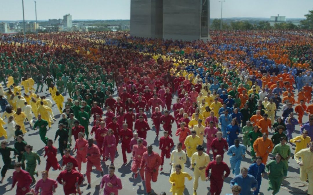
Even more similar to the Apple commercial is Big Ad from Carlton Draught. It didn’t celebrate color—it celebrated beer. (Arguably more deserving of celebration!) Like Apple, Carlton colorfully dressed up hundreds of actors and directed them to run around en masse. In this case, the actors ultimately formed a moving image visible from above.
Not that my own aberrant taste should enter this discussion, but Big Ad might be my all-time favorite ad. How I would love to have been on that shoot.
With Color Flood, it could be argued that Apple pulled off the challenging “Double Borrow.” It borrowed from its own iPhone 7 ad, Balloons, which had already borrowed from the Sony Balls ad.
Will prosecutors now bring charges against Apple in the imaginary Advertising Hall of Creative Justice?
Not so fast. I refer you to the teachings of my original mentor in the world of Apple advertising, Steve Hayden—creator of the 1984 Super Bowl commercial.
Steve believed in The Seven Year Rule. That is, it’s okay to artfully borrow from an ad that’s more than seven years old. We ad industry people might remember such things, but ordinary human beings do not. They actually have a life.
Since the Sony and Carlton Draught ads ran more than a decade ago, all charges must be dropped.
But hold on, Apple, we’re not done with you yet. Color Flood actually has more serious issues.
Like any sighted person, I did get that the ad was about color. I just wasn’t sure if it was about display quality or the color of the phone itself. I suppose I was tainted by my prior knowledge that XR is the only iPhone that offers a choice of colors.
Once I got past that confusion, I felt incredibly thick. Then I consulted Mr. Internet and discovered that the ad had brought out the thickness in many Apple-savvy observers.
But, unlike me, who ultimately saw the light, many were drawing the absolutely wrong conclusion.
Apple Insider ran the headline Apple’s latest ad uses human ‘flood’ to sell iPhone XR colors. To remove all doubt, the subhead said the ad was “concentrating on the chassis colors buyers can choose from.”
Then there was this article. And this one. And this one. And this one.
This is quite an accomplishment, really. I don’t remember any ad in Apple history leading so many writers to totally miss the message. That’s an especially grievous failing, given the size, expense and importance of this effort.
Strategically, there’s a whole other issue. By celebrating the amazing colors of iPhone XR in such a spectacular way, one would logically conclude that the XR display is the best Apple has to offer. In fact, it has the lowest quality display of all new iPhones. That’s confusing in itself.
I repeat: I thought this ad was hugely enjoyable, on a scale most ads never reach. It just seems that the Apple was more focused on having fun than being (a) clear about the message, and (b) strategically brilliant.
It might have made far more sense to simply change the end titles, making it an ad for the entire iPhone family. The message would have been clear: iPhone brings color to life at every price point.
No one can argue with Picasso on the subject of creativity. So here’s to an exciting future of borrowing and stealing—hopefully with some Jobs-style common sense mixed in.

brilliant
Apart feel the colored-jumpsuit people sometimes looking like they were breaking out of jail, the visuals for this ad seemed ok. But I personally hated the music choice. Didn’t go with the visuals at all. It felt like they took all the songs from the Apple Watch ads and blended them into one bland song. The ad also feels sooooooooooooooooooooooooooo long.
I liked the music so much I downloaded the song!
wow, totally disagree with that, although understand the issue. I love the music. the contrast is fantastic with the parkour. could have watched an even longer ad. i didn’t really care what it was advertising. I’ve watched it a dozen times at least (and randomly found this site too). Great article, thanks for writing.
I am trying to figure out how this ad was created.
I too would like to know how this add was made
I’d like to know if they digitally colorized it or used tons of different colored jumpsuits.
It would be great to see a video about the making of the color flood ad.